6 innovative grassroot mashups for transparency
Some weeks ago I wrote a post about a new initiative by UNHCR, which promotes the use geodata mashups to provide information about refugee camps all around the world. Today, I saw another initiative by the World Bank called geo.worldbank.org: "Our work around the world." Again, it is a nice service, but does it offer much more than the website?
Paul Currions points it out well in his post that the UNHCR map "is useful because it starts to give people an idea of one of the key issues for refugee management and the complexity of running a refugee camp. The first thing I notice is that every time I click on a link for more information, it tells me how much it costs to buy school or farm equipment, and gives me a link to UNHCR fundraising so I can cough up right there. I think we should be doing better. Much, much better."
I agree with Paul Currion and wonder why these services do not offer the following:
- Integrating other available sources of information to offer a broader perspectives on the given context. There are many other potentially valuable resources, which could enrich the visualization.
- There should be ways to contribute information, for example, by refugees themselves or beneficiaries of World Bank projects. Couldn't mashups used to get feedback and to monitor projects and their impact?
- Gapminder.org illustrates nicely what further ways are possible to simplify complex data.
Interestingly, there are a lot of grassroot initiatives offered, which are often developed and maintained by a few people and sometimes even one person who accomplishes much more.
- Tunesia Prison MapSami Ben Gharbia put up together, already a while ago, the frightening Tunesia prison map, in which he has been using google maps. It shows where political dissidents have been locked up by the Tunisian government.
- Theyworkforyou They work for you was developed by Rob McKinnon, whom I had the change to meet back in London. This inspiring project has a sister in the UK "that aims to make it easy for people to track the activity of Aotearoa New Zealand's Parliament." Basically, this site aggregates information already available in a form that makes it more transparent to follow the engagement of parliamentarians and topics. I am really impressed about his work and looking forward to see more of his ideas realized in the future.
- UNdemocracy This is again a website which aggregates available information and offers it in a transparent way. It focuses on an easy access to the transcripts of the General Assembly and Security Council of the United Nations. The same people also did the Public Whip, a page tracking the voting record and attendance of parliamentarians in the UK.
- Ushahidi This website was quickly realized through the recent Kenya crisis and maps the reports of the post-election crisis with all its different incidents such as riots, deaths, property loss, government forces etc. Kenyians can report such cases through their mobile phones by sms. This truly is a bottom up mashup.
- **Mapping the election conditions in Zimbabwe
**
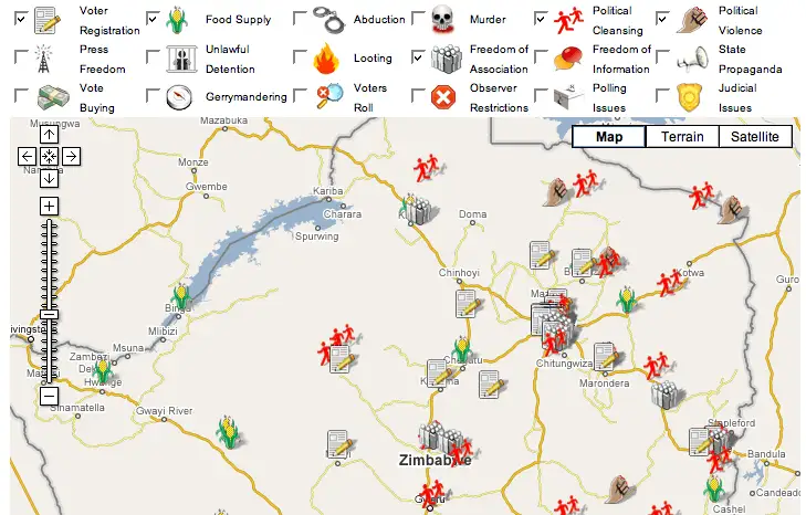 This is a similar initiative, which documents all types of manipulation during the latest Zimbabweans election. The map is a valauble resource and Sokwanele has been doing an impressive work for human rights throughout the the last years. Ethan Zuckerman wrote an in depth post about this project.
 - Healthcarethatworks Another Google map mashup, which shows the New York City wide status for hospitals and its disproportionate impact that recent hospital closures have on low-income communities.
Some more mashups in the enviroment field are summarised on Global Voices by Juliana Rotich. Lastly, Netsquared has on this year's conference a mashup event, where promising new initiatives are presented.