Spoil the user? Why are not always the WYSIWYG Editors the right way?
Last week, I was at the re-publica.de conference. Often, the most interesting aspect of conferences are the side talks with other visitors. And this one was not the exception. I had a great chat with Martin Koser, an enterprise2.0 expert (with excellent bookmarks) and Andreas Gohr, the head developer of the interesting DokuWiki. We discussed in length the barriers and potentials to start implementing social software in organizations and once again agreed on the importance of the organizational culture. But the technical side is also quite complex and, for example, wikis can be implemented in various ways.
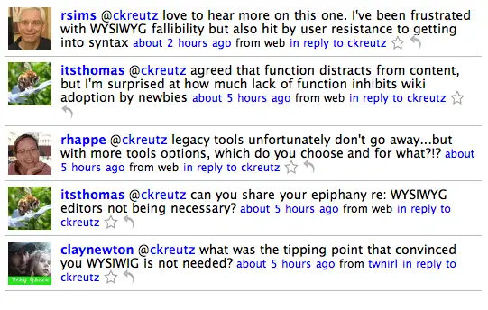
So far, I am amazed about the collaboration potential of wikis, but also disappointed about their usability. Until this discussion, I was kind of convinced that the user shall be in the focus. Participation should be as easy as possible, so no technical barrier hinders users to add or edit content. But Martin and Andreas surprised me at one point by saying that WYSIWYG are not necessarily an advantage. I shared my surprise on twitter, which brought up these reactions, and hence, I decided to write a blog post about it:
So far, I argued for WYSIWYG editors for these reasons:
- There are different little barriers one has to bear before one can start editing a wiki page. Most people are used to Word, and WYSIWYG editors are familiar in this regard. Cryptic code might be confusing and needs some experience.
- WYSIWYG give guidance and integrate nicely other media such as images or table.
- A wiki is not seldom confusing because of its missing hierarchy. WYSIWYG editors ease to set up new pages or link to existing ones.
- Many wikis still lack user orientation and are rather confusing (e.g. no hierarchical menu or insufficient linking). The less a user has to think or adapt, the better. Content should matter.
So here it is a list of arguments against WYSIWYG editors. Martin Koser also wrote another excellent post about it.
- Too much function distracts from content. It is the same problem with Word. Hours spent on elaborating sophisticated tables instead on concentrating on the content.
- Code editors limit users and let them focus on structured content -- what is useful and which structure (e.g. header and bullet point lists) is best for the reader? If used properly, those texts have more clarity.
- WYSIWYG invite to paste all content completely from word, which is not necessarily conducive for collaboration.
- Basically, it is a short code list to learn, and then you can write faster and it is more simply to edit codes.
- No doubt the code created by WYSIWYG is often a mess and does not separate content and formatting.
Does that convince you? The discussion, once again, showed me how complex the implementation of social software can be, or how easy if you just let the people use it. The question of WYSIWYG editor might be trivial, but in contrary, the lack of those editors are a key argument to decline social software, as Martin pointed out.
